
The second to the Last of Three oops four parts on the Team Interception Feature in Strat-O-Matic Pro Football.
The real-life 1970 Lions scored 4 TDs on 28 interceptions. Is this better or worse than expected?
“Sometimes,
the season itself is the outlier”
–Scott Everngam
In the previous installments, we explored the design intent of the feature, and the challenges in evaluating the raw interception return data a season might produce. We’ve shown the feature is pretty good at distributing the most return yards to the most threatening teams; in as few as six replays real trends start to appear that mirror real life team results. We’ve show it is an improvement over the stock interception chart. But we haven’t tackled the final objection- why is it a season like 1975, which had 533 interceptions but only 25 interceptions returned for TD, or 1977, which tallied 562 interceptions but only 28 returned for TD will come out consistently high when using this feature?
Well to look
at this, I created a graph of every season’s Real Data from 1956 to 1981,
effectively bracketing these years, plotting the season’s overall interception
return yardage average and pct of overall interceptions returned for TDs. And while the fit is not perfect, it is not
exactly a random walk, either. At the
season level, the best fit for TD pct vs return average over the range of data
we see is a second order power law, implying a fairly strong push upward in “house
pct” as the average yardage per return increases. And here it is:
Figure 1:
Season Level Real Life Data for Average vs TD PCT, 1956-1981

It’s a pat
answer but I haven’t explained why this is true. It’s a heck of a lot of data,
if this were a normal distribution 26 seasons and 13,095 interceptions should
produce a pretty nice chart, not the messy correlation we see above. But the overall data set is neither
continuous nor normal; the y axis response is low frequency binomial (yes/no) data,
and each season is a collection of subsets of team data that lie beneath its
sums. If you look at the team data over
the same period, you see it has some very interesting properties:
Figure 2: Team
Level Data, Aggregated by Range

There are no
seasons that sum out as low as the lowest team ranges or as high as the highest team ranges. Seasons are populations of teams. At the team level both the TD percentage and
the percentage of 0 TD returns in the sample range are strongly correlated to
the average yards per return. The latter case is in the inverse, as teams with
interception return averages less than 12.0 will fail to get even one TD more
than half the time. It’s important to
note that even real-life teams that had very high return averages might fail to
tally even one TD in one out of eight (or so) cases.
Another way to look at it is 18 pct of teams had 17 yds or greater per return; these teams accounted for 25 percent of the total yards and 30 percent of the total touchdowns during this interval. Six out of seven of them with have at least one TD, as opposed to two thirds of the total.
I keep harping
on these high average teams because
they help to explain why certain higher average return seasons have such high variability.
Season such as 1975, which averaged in the mid 14 yards per return range
do not have every team as a high performer. Instead, a higher seasonal average is more an indicator that there are also some high potential teams mixed in with the rest of
a typical population, rather than a guarantee of high return touchdown percentages. If we return to
the original chart, we see three teams had similar overall return avg stats but
different TD percentages (again real-life data):
Figure 3: Team Level Data for three NFL seasons in the mid 14s for average yard per return

That’s quite a range of TDs and House Pcts from a narrower range of inputs, but actually all three are possible based on the underlying data, which is decidedly not continuous nor normally distributed. There is no guarantee that a team with a high return average will meet its potential and no guarantee that a team won't uncork a TD when the rest of the real-life teams with similar averages mostly didn't.
Looking at 1975 we see that other than
Baltimore that key team population at/or/over 17 yards a return is not carrying
its weight in TDs, with four teams out of the top eight not getting any at all.
That number should be one out of eight when considering NFL History, so this type of distribution will happen about 1/80 times. Unlikely, but not impossible.
Figure 4: Team Level Data for 1975
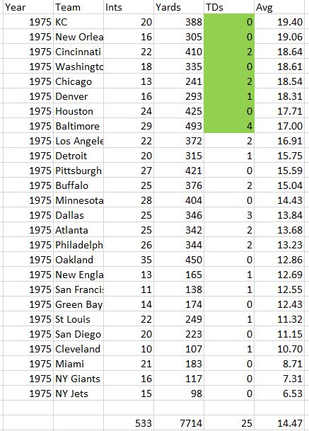
Figure 5: Team Level Data for 1971

And, finally, the high field, 1966. Here the top teams are robust and are also supported by good seasons from Miami, Buffalo, and LA. This outcome is also merely unlikely, but not impossible:
Figure 6: Team Level Data for 1966

In summation, some corrections on team charts can be made to try to tame high observed interception return TDs. But there are limits on how far you can go, and to how much these adjustments will translate in seasons with higher return averages. Throughout NFL history, it can be shown that there is a strong correlation between team interception return average and the percent of these interceptions returned for touchdowns. And the goal of the feature is to closely match relative return yardages within a season, if fed the same number of interceptions per team.
It is also possible that the season itself is an outlier when its combined team population's results are compared to all teams in NFL History. One must consider what the predicted outcome is likely to be, not just a deterministic idea of what a statistic should be based only on a value, and not within its context.
Note: the original questions on the Forum concerned 1977, which is why I mentioned it. But, unfortunately, I don’t own 1977 to test in detail, so I chose 1975 to illustrate the point. Teams like 1975, 1977, 1979 and 1981 are all somewhat analogous, while the mid to late Sixties are also analogous on the high side.
Fred
Bobberts
No comments:
Post a Comment